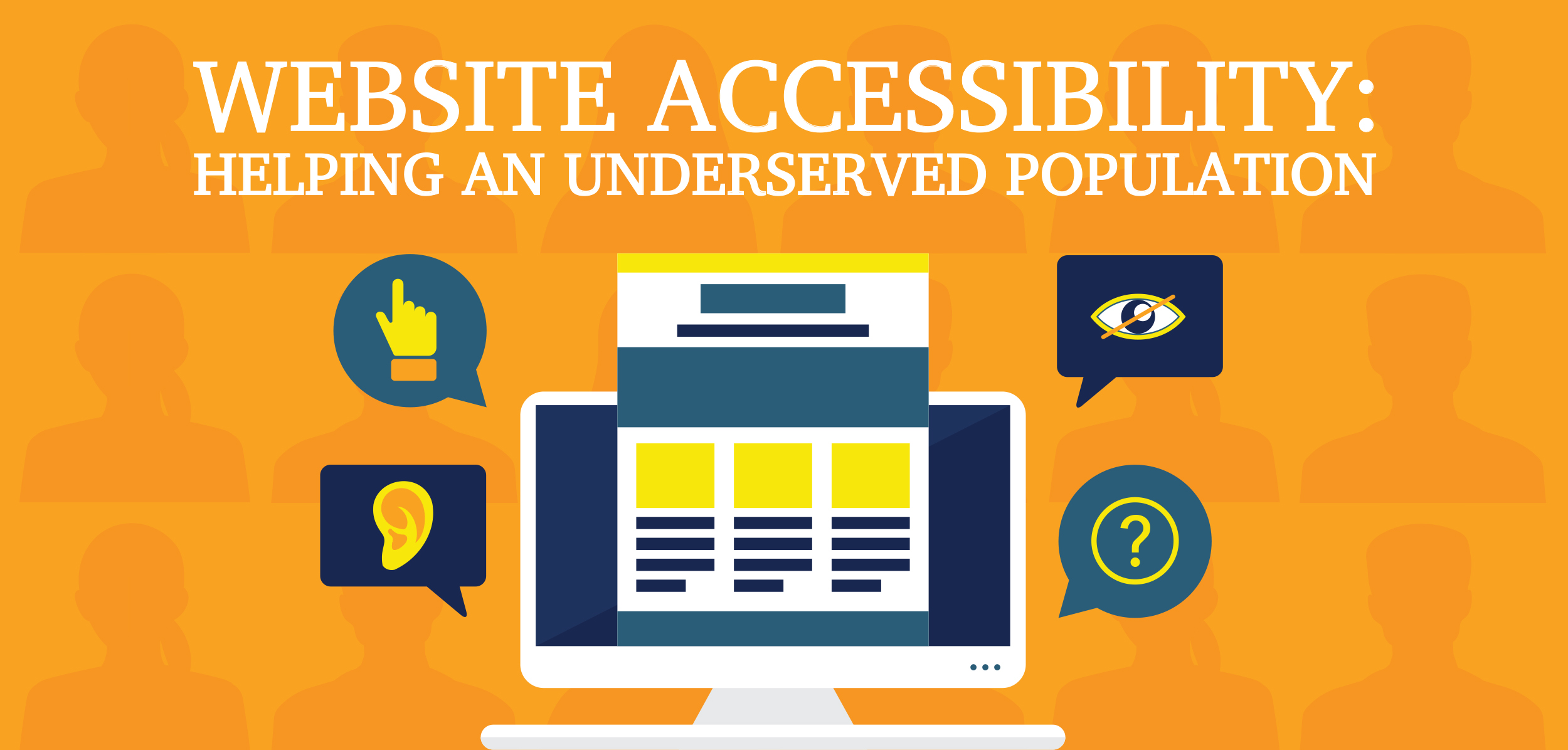
Website Accessibility: Helping An Underserved Population
Posted on March 14, 2019
-
Category:
- Atlanta Web Design
It’s no secret that persons with disabilities face a bumpier customer journey online than their non-disabled counterparts do. But not everyone realizes that the United States government has stepped in to help. It requires U.S. federal agencies and organizations that receive federal assistance or funding to maintain accessible websites per the Web Accessibility Initiative’s Web Content Accessibility Guidelines. Note that even if you don’t have dealings with the federal government, you may still need to meet WCAG requirements in order to comply with state or local laws. And in any case, having your website be accessible makes good business sense.
In “Easy Checks — A First Review of Web Accessibility,” the WAI outlines a preliminary compliance checklist. Highlights are listed below:
Creating page titles
Craft unique titles for each page. Keep in mind that large font sizes and low-resolution settings can cut off page titles.
Composing alt text
Describe essential (non-decorative) images appropriately. An envelope email icon should be designated in the alt text as “email,” not “envelope.” Also, reference complex information along with text that’s embedded in images.
Designating headings
Use at least one heading per page. Mark up all headings in a meaningful structure that:
• Permits keyboard access (mouse-free navigation)
• Supports screen readers
• Minimizes confusion
Choosing site colors and contrast levels
Let visitors change background and text colors without sacrificing functionality. Normal-sized text should use a minimum contrast ratio of 4.5:1.
Resizing text
Confirm that all site elements operate using multiple text size settings and zoom percentages. Text should not:
• Change its line spacing, font, or size
• Cut off, compact, or disappear
• Require horizontal scrolling
• Overlap with other content or otherwise wrap awkwardly
Enabling keyboard access and visual focus
Verify that keyboard access is enabled and visible without compromising functionality or logical structure. Confirm that visitors can tab to and away from applicable elements.
Presenting forms, labels, and error messages
Forms and labels
Position instructions and labels correctly and define them clearly. Designate mandatory fields using a text indicator (e.g., “required” or an asterisk). Don’t rely solely on colors to convey meaning.
Create and mark up visible labels for:
• Form fields, legends, and other controls
• Field-specific instructions (e.g., telephone number formatting)
• Text indicators
Error messages
Confirm that error messages are being generated for (a) mandatory fields that don’t contain information; and (b) all fields whose information is formatted incorrectly. In both instances, submit the form data for each field and add error messages as needed. Provide clear instructions for correcting the problem, and again, use text rather than color to transmit meaning.
As a best practice:
• Add corrective guidance to relevant form fields
• Display error messages during initial data entry
• Script error handling so that customers won’t have to rekey lost information
Displaying content that moves, scrolls, blinks, or flashes
Moving, scrolling, or blinking content can range from advertisements to carousels, videos, and auto-updating information (e.g., stock prices, news feeds). If this content begins automatically and lasts longer than five seconds, users must be able to:
• Pause, stop, or hide the content and/or its movement
• Control the frequency of automatic updates
Also verify that content flashes or blinks no more than three times per second.
Presenting multimedia content
Audio and video content must permit keyboard access without a mouse. It’s best that content not start automatically, but if it does, it must:
• Let users reduce the volume and pause or stop the audio
• Last no longer than three seconds
Automatic captions (subtitles) don’t satisfy WCAG accessibility requirements. Captions must (a) appear in their specific language; and (b) be synchronized with spoken content. Identify all speakers, and include essential sounds like a ringing doorbell. Providing transcripts and audio descriptions is encouraged.
Testing your work
Basic structural check
Evaluate how well your webpage functions when images, styles, and layout are absent. Pages should maintain overall logical order and describe images adequately.
Review of all page elements
Determine the accessibility of all elements on your website using:
• Multiple browsers (typically Internet Explorer, Firefox, Chrome, and Safari)
• Voice input/commands
• A keyboard—with and without a mouse
• A screen reader
• Automated options like IE WAT, BAD, and the WebDev toolbar
People with disabilities have historically been underserved and overlooked. Today’s web designers and developers are changing that, one page at a time. To learn how you can make the customer journey smoother through an accessible website, please contact us.
Some information in this article is taken from the Web Accessibility Initiative (WAI) document Easy Checks — A First Review of Web Accessibility. Shawn Lawton Henry, ed. Copyright © 2017 W3C® (MIT, ERCIM, Keio, Beihang). Status: Draft updated 22 December 2017. http://www.w3.org/WAI/test-evaluate/preliminary/
This article doesn’t cover every contingency regarding web accessibility reviews, list WCAG requirements in full, or offer legal advice. For specific guidance, please contact an independent advisor.