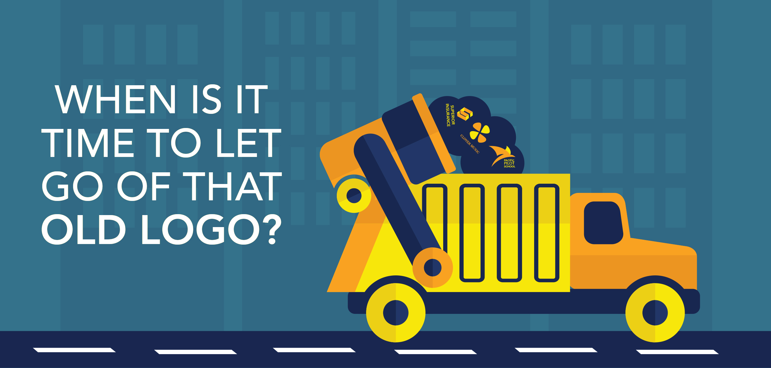
When Is It Time to Let Go of That Old Logo?
Posted on February 2, 2019
-
Category:
- Atlanta Branding
A logo design gives your brand an identity, so it should reflect the personality of your business. Your logo is the first impression you give. To be recognized by consumers, your logo must be easy to read and unique so that it stands out from your competitors’ designs. Colors and fonts are chosen based upon your brand story and target audience. A well-designed logo delivers a clear message about your brand, and it resonates with the consumer.
Consumers associate high-quality logos with brands they can trust. To become a quality brand, you can’t use a poorly designed (pixelated, confusing, outdated) logo because it can potentially harm your business. Using stock logo services is not the best idea for strengthening your brand because many of those logos are tweaked so that they can be sold more than once. If you aren’t willing to invest in developing a professional logo design, why would consumers even bother purchasing from you? If a limited budget is why you don’t have a professionally designed logo, then your budget will always be limited because your brand won’t expand.
Logo Evolution
Your logo may need to change its appearance slightly because everything evolves over time. To ensure your brand stays ahead of the curve, you must continue to do research on your industry. Some of the best-known brands have changed their logos over the years. You can learn something from the big brands by making incremental changes like they have done.
These changes can include:
• Creating or modifying a tagline
• Changing the brand colors
• Using a new font
• Evolving the brand’s mission
What’s Trending?
Whether you’re looking to redesign your logo completely or make slight adjustments, your logo should be relevant and not outdated a few years from now. You can incorporate some of the latest design trends to keep your brand fresh.
Here are a few logo design trends that will continue through 2019 and beyond:
1. Negative Space
The use of negative space has been popular for a long time, and there’s a reason why. It can turn a simple design into a memorable logo with a hidden message. The key is to focus on the details of an object and incorporate those details within the typography. Negative space can be used in unexpected ways.
2. Playfulness
Using distortion or warping is a way to break out of the norm in logo designs and make the text playful. You might also consider options that play with perspective. Having playful icons can leave a powerful impression on consumers. Your logo can be fun while also being innovative.
3. Responsiveness
It is important to have a logo that reads well across all platforms. Due to an increase in mobile interaction with brands, responsive logos are a significant improvement to the mobile experience. A responsive logo is completely scalable to any screen size.
Now that you understand the importance of keeping your logo current, we hope that your brand’s mission and logo progress together so that one doesn’t outgrow the other.
If you need help with freshening up your logo, consult with a professional graphic designer by contacting us here.