The Impact of Color Theory on Graphic Design
Posted on April 17, 2023
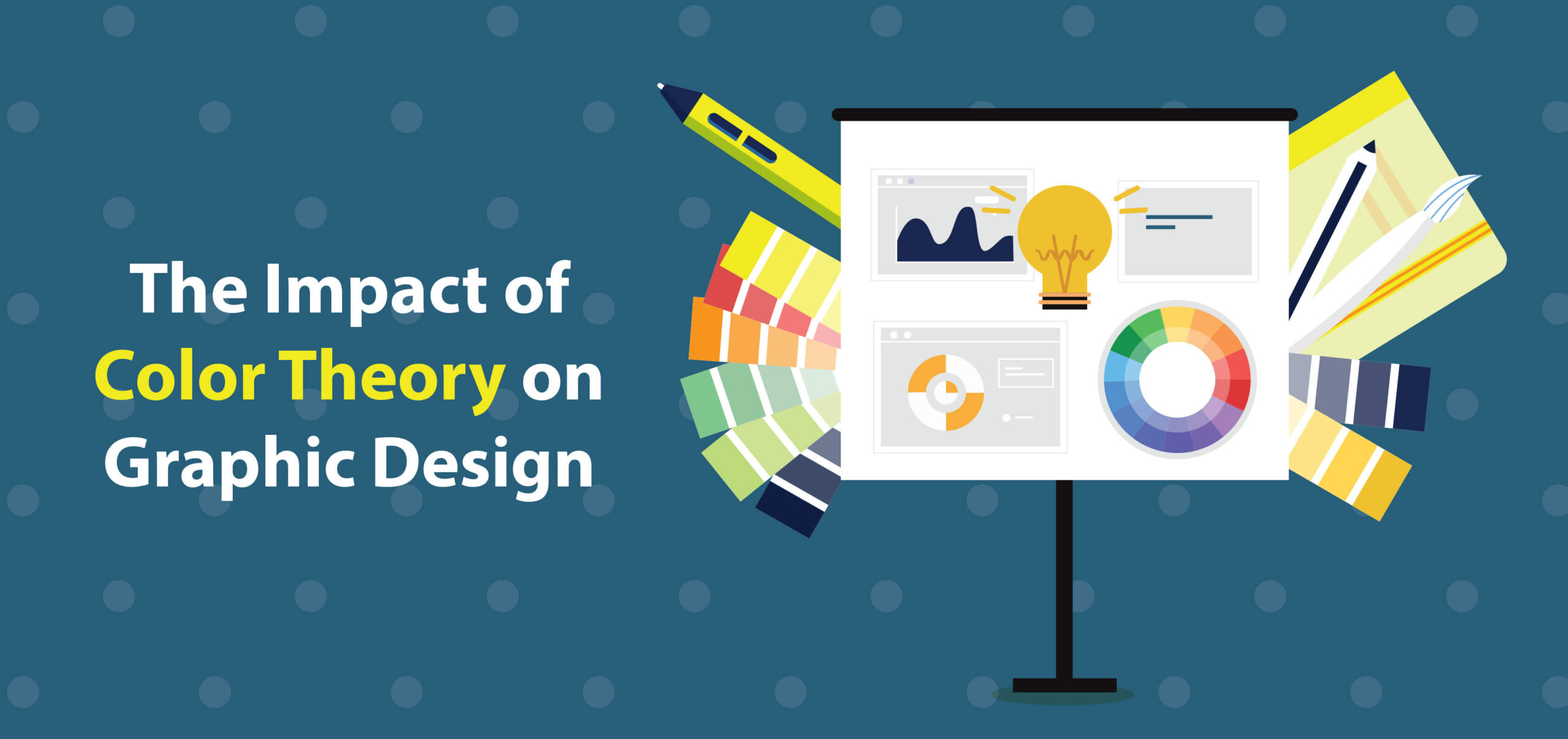
Although we may not be consciously aware of it, graphic design plays a powerful role in our daily lives, conveying information through images, fonts, colors, and symbols. Color can have an especially significant impact on how we perceive and interpret designs. To understand that impact, let’s look at color theory and how it’s used.
Color theory, also known as color psychology, is based on the idea that colors can influence how we feel and think. Designers can use this knowledge to create powerful logos, packaging, or other visual communication materials. Understanding color theory helps organizations create memorable user experiences in several important ways:
1. Setting the Mood
A compelling brand begins with colors that evoke the right emotional responses in your target audience. Here are some examples of colors and their associated emotions:
- Red—Urgency, excitement, hunger, passion
- Yellow—Happiness, warmth
- Green—Nature, relaxation, growth
- Blue—Calmness, trust, stability
An effective brand identity is grounded in the principles of color theory. That’s because color choices affect the authenticity of a brand’s personality and values.
Keep in mind that the impact of a given color may vary depending on the age, gender, and personal and cultural experiences of your target audience. For example, white is often associated with purity and innocence in the West, but it represents mourning in some Eastern cultures.
2. Communicating Information
3. Creating a Visual Hierarchy in Graphic Design
Colors can also be used to establish a visual hierarchy in graphic designs. A visual hierarchy is the arrangement of design elements in a way that guides the viewer’s eye from one element to another. Visual hierarchies can signify the logical order of information using a variety of fonts and color contrasts.
4. Enhancing Readability
The readability of your written content can be optimized with the right color choices. For example, dark text on a light background is easier to read than dark text on a darker background. By using color combinations that enhance readability, designers can create content that is easier for viewers to understand.
5. Optimizing for Accessibility
Accessibility is related to readability, and it’s another critical aspect of graphic design to be considered when applying color theory. Certain colors and color contrasts can affect people with color blindness and other forms of vision loss. Web accessibility standards seek to level the playing field for all website visitors, not just those with 20-20 vision. For example, color combinations must meet accessibility standards so that people with visual impairments can easily read the text. Fortunately, designers can use online tools to perform accessibility checks on their websites.
Applying color theory isn’t an extra step in the design process—it’s an essential part of content creation. When colors are used for the right demographic in the right context, they can help capture interest, improve readability, drive engagement, and strengthen conversions. To remain current on trends in color theory is to give your organization a competitive advantage and your brand a wider reach.
Atlanta-based graphic design agency Badie Designs LLC specializes in creating innovative marketing, UX/UI design, and branding solutions for a broad spectrum of organizations. Contact us today for a consultation.