Top 5 Ecommerce Website Designs In 2018
Posted on October 5, 2018
-
Category:
- Atlanta Web Design
Ecommerce websites have become the future of shopping. It is more convenient to let items arrive at your door than to stand in long lines to buy them. More brick-and-mortar stores are closing due to the power of online shopping. There are many websites competing for customers. If your website fails to present a user-friendly experience then you’re missing out on sales. An attractive website that’s mobile-optimized is the key to having online success.
We have listed the top five ecommerce website designs in 2018. This list should give you some ideas on what features to use to improve your website.
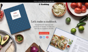
The New York Times Cooking site offers a personalized way to browse years’ worth of recipes. It also includes easy-to-use options for creating your own hardcopy cookbook. For example, you can choose from popular dinner recipes and categorize them by chapters. There is also an option to select the type of binding you want when it’s time to put the finishing touches on your cookbook.
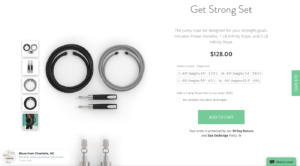
Crossrope offers a fun jump rope experience. What makes them stand out is their commitment to their customers. They not only sell products, but also engage with their customers by providing them tutorials and challenges to achieve their fitness goals. This website uses white space to make their content more legible and to focus the user’s attention on the images surrounding the content.
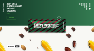
Simply Chocolate of Copenhagen, Denmark, delights readers with a fun and interactive website that showcases each product with its ingredients in motion. Using the parallax scroll effect, you can view all their products easily and unwrap the chocolate bars. Simply Chocolate uses minimal information because the images tell the story. This website also uses creative headings with consistent content.
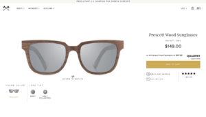
Shwood offers the world’s finest wood sunglasses and eyewear. Their rotating feature is great for viewing all sides of each product. The product pages use animation to focus on the sunglasses’ features and materials. Once the user’s attention is captured, videos reveal the process. Everything you need is on the product page so there is no need to go searching for details.
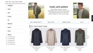
Marks and Spencer is a major British multinational retailer based in London. This website offers a range of great filters, but our favorite is the rating system—and we’ve discovered that too many retailers don’t use it. Potential customers like to read reviews when they’re not sure what they want to purchase. Filters can serve as search engines for products, and smart filtering makes the user experience helpful by narrowing the search.
Need help with improving your ecommerce experience? Contact us to get started.